Why Shots Work.
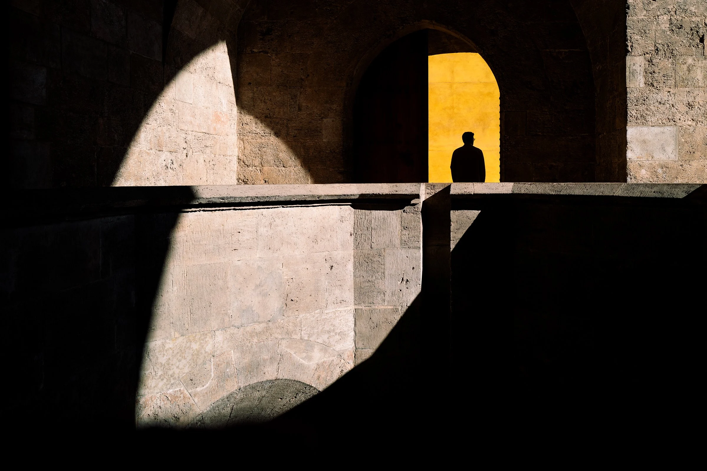
Torres De Quart, Valencia | Leica Q2 // 28mm // f/5.6 // 1/500s // ISO 100
Some of my best photos are taken when simply being a tourist, that why I loved my Leica Q2. I don’t need to carry my heavy professional kit with me all day and I can still take pro-quality photos. This is a personal favourite of mine, why does this particular shot work?
Harsh sunlight? Stop down, let contrast be your friend!
To the naked eye the shadows weren’t as deep, and the yellow wall was not as vibrant. To a camera set to its default exposure, the harsh sunlight blew out the highlights. I noticed interesting shapes from the strong sunlight being blocked off by the walls behind me and set my preview exposure to -2 stops, it was only when I looked through the viewfinder that I saw the potential in the composition, the deep black shadows and vibrant highlights looked amazing!
Subject = Success
I took the same photo without the person…it wasn’t great. The image didn’t give a place for the eye to rest. In this image the subject allows the eye to focus on an area of interest and adds an element of curiosity. I like that the silhouette overlaps the most vibrant area of the photo, doubling the emphasis on where the eye should land.
Composition Rules
The key area of the photo falls nicely into multiple rules of composition. It fits perfectly into the upper right intersect of the rule of thirds, almost fits perfectly into the Fibonacci spiral and sits on the shoulder of the golden ratio. The vertical brick line in the middle of the photo is perfectly aligned to the centre vertical line of the image, the horizontal brick line is on the upper line of the golden ratio.
In my naive youth I thought composition rules were ‘restrictive to creative expression’. When I look back at my favourite photos, they all follow common composition rules, even my candid ones! I would encourage any amateur enthusiast to learn about the rules of composition sooner rather than later, you will save a lot of time!
Colour Family
I’m still new to the subtle art of colour science, it’s something I aim to get better at. When editing I use color.adobe.com to find a colour harmony that can balance the photo. This image has a monochromatic colour harmony (yellow through to black). The original photo was well balanced anyway, but I used lightroom to remove some magenta and red creeping into the mid tones. It’s a marginal gain that really helps improve quality by removing distractions.
Compact cameras have a beautiful place in the world of photography!